Monday, September 17, 2012

Workshop with Amaya Gurpide


Last July, while working on the repeat monster panel, I had the privilege of attending a figure painting workshop with Spanish painter Amaya Gurpide in her studio in Madrid in the evenings. You can read about the career of this young woman in her website, but in a (really small) nutshell, aside from her training here in Spain, she has also honed her skills studying in the traditional atelier method in New York´s Grand Central Academy as well as the Arts Students´ League.  It was a fantastic opportunity for me to absorb knowledge from her as it was to share the 4 weeks in her studio with 5 other young artist students of the Escuela Superior de Dibujo Profesional here in Madrid, where Amaya is a faculty member. She is a talented, indefatigable and selfless teacher, always willing to help and explain with great patience. The experience was well worth the time...

The workshop centered on drawing and painting the figure, focussing mainly on how to exploit values to define and round out the form. After several sessions dedicated to drawing the model in front of us where we were taught/reminded how to "see" and look at the figure, we went on to painting the model in oil, using string of 9 pre-mixed values which were used for the underpainting layers and which were later adjusted in chroma and temperature by using a very limited palette of 6 colors. Perhaps I´ve summarized the process, and there is a lot more to it than what I´ve said here, I hope Amaya doesn´t pull her hair in frustration reading this...

Here is what our palette looked like:


The lower string is the pre-mix of nine values used for skin tones, and you can see the row of 6 colors in the upper row: white (preferably lead white), yellow ochre, cadmium red, raw umber, ultramarine (or cobalt) blue, and ivory black. All you need, really, for just about anything.

And here is a detail of my result after 8 sessions. My hat is off to our model, so utterly professional and patient, and full of good cheer even when she was understandably exhausted.


Another 3 sessions would have been perfect to finish off the painting.  Here is what the whole canvas looked like. It measures 41 x 33 cms. You can see the different phases of underpainting in the mid-section and the lower extremities. It is only the portion shown in the previous photo that I consider complete with all the values corrected, the forms rounded out and the color temperature more or less correct.


Thursday, September 13, 2012

Five months later...


I´ve been so conscious about the almost five month lull since the last post that I´ve just been hoping no one has come to visit this blog to notice my inactivity. "Inactivity" is actually the antithesis of what´s been going on...
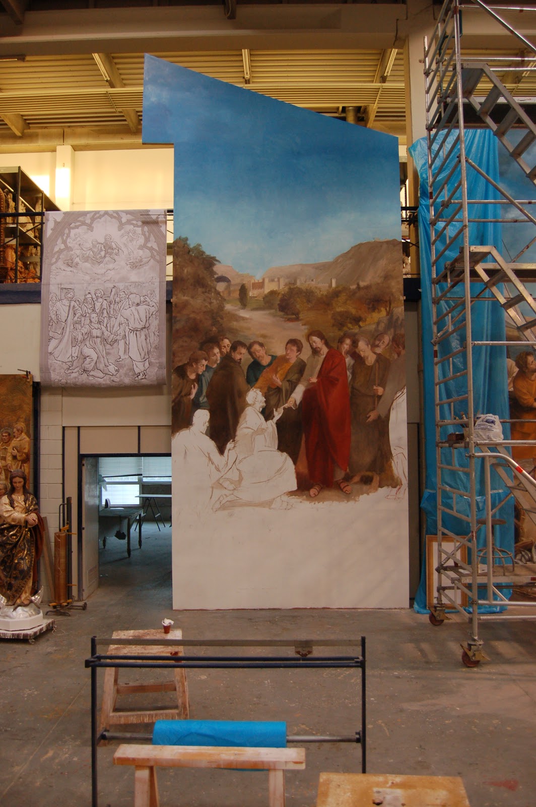
After the initial installation of my monster panels in Sta. Comba, a problem arose in the second panel that required a solution. The solution being nothing short of repeating the panel...well, half the panel. The lower half. The one with all the figures.
Long story short, I re-painted it changing some details (I decided to include some friends as Apostles and change the color of Christ´s robe) and we finally installed the re-done half in the church last August 23rd.
Here is the panel in the workshop upon completion.  


...and this is how the whole altarpiece now looks. At first glance, the only difference is the color of Christ´s robe. It is only upon closer comparison that the other faces become evident as well as the treatment of the foreground, having added the Roman pavement and changed the large rock on the lower right somewhat. All in all, I am much happier with this second version -- there seems to be better overall chromatic harmony now and the predominant lines in each panel seem to converge towards the centerpiece more as well. I don´t know, just something I notice...


Tuesday, April 17, 2012

In the province of La Coruña


...lies the town of Santa Comba, about 35 kms northwest of Santiago. My monster panels were finally installed in the church of San Pedro in the center of this town. The simple, austere church was built in the 50s (I was told) and is of a modern design with a single aisle down the center and pews on the left and right. It seems wider than it is deeper, and the sanctuary area only used to  hold a large Crucifix on a blank, white wall. I had to go over and do the final touches and retouches after the installation of the panels which took two whole days. This is what the two paintings look like in situ:


...and a couple of shots of the retouching in progress. Shouldn´t be afraid of heights anymore after this, I guess...


Santiago is one of my favourite cities in Spain, lovely at night when it rains...


Monday, April 16, 2012

Eduardo Rosales

...is another Spanish great from the 19th century.
Born in 1836 in Madrid, he completed this painting at 28 years of age while in Rome in 1864 and entered it in the National Exhibition of Spain in the same year where it garnered a first prize medal. The scene represents  Isabel the Catholic Queen dictating her last will and testament. The Queen is shown on her death bed with King Ferdinand seated on the left and next to him stand their daughter Juana (the fututre "Mad" queen from the previous 19thC painting posts) and on the right are various members of the court.

Aside from the obvious mastery and handling, what rivets the viewer most is the way the artist has captured the various expressions of the characters involved, leaving no doubt as to the gravity of the implied consequences of the imminent demise of the Queen, and the uncertainty of the future of the kingdom. All of this is manifest especially in the King´s face as well as the Princess´, heir to her
mother´s heavy responsibilities.

As usual, as I tend to gravitate towards the initial ideas of the artist, what I consider the primordial instinct of expression, of equal interest is the charcoal with white chalk compositional study. The initial idea was to place the figure of the King on the right, next to the scribe, and leaving the figure of Juana alone on the left. The final composition shows a more balanced distribution of figures, avoiding the "redundancy" of the double-seated figures that appear in the drawing. I find particularly exquisite the standing profile figure of Juana on the left with her downturned eyes and her hands clasped in front of her...reminds me somewhat of Vermeer´s milkmaid of a little more than 200 years before.


Saturday, April 7, 2012

Finished panels


This is how the second panel turned out. There were a few changes that had to be made with respect to the original oil study, mainly the addition of three more apostles (actually, 2 full figures and one head) as well as some modification to the landscape background. The two figures on each end (the kneeling and the standing one, both with their backs to the viewer) were added as I went along, because of time constraints I was not able to make any initial studies for them. Also, the rather large rock on the lower right corner was a last minute addition, a sort of reference to the whole scene that the painting represents: petrus, kephas, "rock"...

...and this is how the original oil study looked like, with a much more arid landscape , with a lot less greenery:

The monster twins look like this side by side. They will be installed inversely in the church, flanking a large, already existing Crucifix centerpiece. Sorry about the obstruction on the right. Sometimes it´s just impossible to move large, heavy pieces out of the way.


...and finally, a couple of parting shots: I could get used to working at these heights...


Thursday, April 5, 2012

Aside from Velázquez, Goya and El Greco...

When visitors come to the Prado for the first time (or the second or third), they invariably come to see The Greats: Velázquez, El Greco, Goya etc...No doubt good choices. There are few things as artistically uplifting or enlightening, or timeless  as standing in front of pieces like Velázquez´ Las Hilanderas: looking at that dingy workshop, you can smell that stale air and imagine the bodily odors from the women working busily. Or his Cristo de San Plácido: you  gawk at that pale white Torso glistening with sweat, so gracefully limp and dead. You begin to appreciate the Sevillian´s great understanding of anatomy and wonder how easy he makes it look and how difficult it really is. "Cockroach" is the word that always comes to my mind--because that´s what I feel like next to him.
El Greco´s unique use of colour is also something that the visitor walks away with. I remember copying an El Greco once in the museum and breaking my head over what his procedure might have been because I saw neither rhyme nor reason in his use of colour and yet everything made sense.
Of course the other Spanish giants of The Golden Age are all up there calling out to us from the past, quietly teaching us all how we should do it.
But today I wanted to focus on the "lesser known" Spanish greats from the 19th century. On two painters and a sculptor in particular. There was a whole generation of such artists from the 1830s to the 1920s and perhaps this could be the first of several posts dedicated to these figures in art history. They are all products of a great classical academic tradition which has now been having  it´s own renaissance in the present day ateliers that adhere to the same academic tenets and methods of teaching.

José Casado del Alisal (1832-1886)
Francisco Pradilla (1848-1921)
Josep Llimona (1864-1934)


 La Campana de Huesca (1880, Jose Casado del Alisal)
 Few paintings have achieved the drama and visual impact that this canvas slaps you in the face with when you encounter it in front of you. Its enormous dimensions (356cms x 474 cms or 11 1/2 ft x 15 1/2 ft) and the scene that is represented allow the canvas to impose itself on you and hold your attention for sometime. In a nutshell, the story it represents is the 12th C event in history when the then king of Aragon, Ramiro II, upon learning of a conspiracy against him by some of his vassals, decides to teach them a lesson and decapitate 15 of them and arrange their heads in a circle with the head of their leader hanging from a rope in the center of the circle thus forming a sort of bell (hence the title Camapana de Huesca) that was supposed to "ring throughout Aragon as a warning to other possible traitors" and show off this macabre display of crude dictatorship to the other vassals that had been invited to the castle.
Overlooking the obvious gore, one can focus on the mastery of execution -- from composition to the handling of colour and the treatment of surface texture to expression in both facial and bodily gesture. Breathtaking attention to his rendering of fabric, metal and granite...


 Doña Juana la Loca (1877, Francsico Pradilla)


Painted when he was 29 years old, living in Rome as a student subsidized by the Spanish Academy. This piece was his third submission to the Academy as part of the terms of subsidy required that the artist paint a certain number of paintings of a certain size in return for the allowance that was awarded as part of the "scholarship". Also of enormous dimensions (340 cms x 500 cms or 11 ft. x 16 ft.) like the Camapana de Huesca, Pradilla´s painting focuses on the demented 16th C queen of Spain, Juana, daughter of Isabel and Fernando and mother to the future Carlos I. She is jealously and obsessively guarding the coffin of her recently departed husband King Philip the Handsome as it makes  its way to its final resting place in Granada. Another example of supreme mastery of the narrative apart from the captivating naturalist style that Pradilla (as well as his contemporaries) was known for. This is a piece that involves more than the sense of sight as it also makes the viewer aware of the smell of the smoke rising from the embers; the feel of the cold, December wind blowing across the empty expanse of land; and you can even hear the awkward silence being kept by the entourage as they grow bored by the whole trip forced on them by their mad Queen. Up close, the surface quality of the paint and the masterful painterly brushstrokes are right up there with the rest of the Giants of the Prado.


Desconsuelo (c. 1907. Josep Llimona)

I must admit I am not too familiar with this sculptor´s biography or his career. But there is really  no need for words when confronted with something as eloquent and poignant as this marble piece. An exquisite handling of the feminine form, the sensuous, perfect figure is able to transmit an overwhelming feeling of grief and loss without showing the viewer what can only be assumed to be an equally perfect, beautiful countenance ravished by sadness.

Sunday, March 18, 2012

Moving Along


This is how the work progressed this past week. Still trying to juggle this with my other life. All the underpainting has been completed and I have reworked the sky, adding the clouds, and the final gradation of the blue. I do plan to modify those clouds a bit more...